The Eternal War Between Light and Darkness

Hi everyone, welcome to another installment of me sitting in a corner thinking about what I did then writing about it.

I wanted to push out a blog post sooner, complete with a new gameplay video. However, the day after I uploaded it on Youtube, I made some major changes to the graphics and I was no longer satisfied with the video. So I had to make a new one and then start writing about that.

Before I go through it in detail, I’m just going to show you the new gameplay video and see if you can spot the changes:


Can you see what has changed. Go ahead, I’ll give you some time to think about it.

… … …

Ready? Alright, here we go:

Redundancy eliminated in graphics pipeline. Productivity up, but many lines of code now out of work

This first one is a bit unfair since it’s imperceptible: I rewrote the lighting rendering pipeline so that it works with GameMaker: Studio‘s native graphics pipeline rather than against it. This switch resulted in a 25% boost in framerate, though it’s not perceptible on my dev machine since it is able to render the game at over 60 fps. However, this might help some lower end machines run the game at the full framerate so they don’t have to cap it at 30.

Light and dark embrace more extremist positions

The way light and shadow are blended with the scene was also changed. In the old method, light and shadow were blended in using multiply blending implemented with GameMaker‘s built-in customizable blend modes. The new method uses overlay blending by means of a shader (there was no easy way of configuring GameMaker to draw using overlay blending). Below is a comparison of both methods:

Left: Old lighting using multiply blending | Right: New lighting using overlay blending

If you’re familiar with image editing programs like Photoshop or GIMP, then you should already know the differences between multiply and overlay blending and what they do. If not, then you can click on the links to get the technical explanation, or you can just look at the pretty pictures. The game now has access to a greater range of brightness values by using overlay blending; this not only makes bright areas look brighter but also makes dark areas darker, creating a a more striking contrast between the two:

The increased brightness also allowed me to enhance certain particle effects, such as making the fairy dust created by Réiltín look actually sparkly.

Increasing number of young lights join the occult

I fixed a long-standing problem with how the simple lights were drawn. In my engine, simple lights are lightweight (no pun intended) light sources that don’t cast shadows. They are used for things like lamps, muzzle and explosion flashes, and glow effects. Originally, these simple lights were drawn in post-processing, i.e. simply added on top of the regular (shadow-casting) light source. This had the effect of those lights shining through opaque objects when they should be occluded.

Should be. Could be. Would be. ARE:

In the screenshot above, the spiky hit flashes are properly occluded by the tree trunk in front of them. I left in the option of allowing simple lights to be drawn in post-processing, as demonstrated by the dead, flashing red monsters being drawn through the tree trunk.

Better minimap, better know a district

The minimap in the top-right is a fairly old feature, but before it only revealed the location of items relative to the Reiltin. In this update, it now also shows the location of enemies, walls, gates, decoys and proximity mines:

For proximity mines, the minimap also shows their activation range when primed and their area of effect when they explode:

Click to see full animation

I realize that giving all this information to the player really makes the game’s theme of obscuring things in the dark moot, but in the final game the player won’t have all this info all the time. They will have to use certain items or tools to get additional pieces of information.


Next time, on Feast for the Senses

And here’s some leftover stuff I haven’t finished yet but still want to mention:

Non-rectangular levels: it’s not hip to be square

Up until this point, all the levels I had created for Feast for the Senses were rectangular, whether they be levels for the Arena, free roam exploration, or linear exploration. But what if I didn’t make them rectangular? Here is a irregularly-shaped linear-type level I’ve started working on:

It might not be apparent from this screenshot, but this level is huge. It’s the largest room I’ve ever created in GameMaker. I had to make the sections wide enough to accommodate gunfights and the entire level long enough so that the player doesn’t just blaze through it too quickly.

Birth of a new tileset, the miracle of… uh… graphic design?

I’m starting to get bored of seeing both tilesets that are currently in the game, you know what that means: it’s time to add a new one to the family! The one I have in mine is a little more involved than the others. It makes use of dynamic graphics…

The undulations are almost hypnotic. Yes…

Updates: Mostly Graphical, Some Audio, Some AI

A summary of the updates to Feast for the Senses from the past month. If you have been following along my Twitter, then most of this might already be familiar to you.

The Full Gathering of the Senses

So I finally got off my butt and finished implementing all five sense monster classes: Sight, Hearing, Taste, Smell, and Touch. I renamed the Bearer-class (who’s only job is to hold items until the player destroys them) to “Pain-class” to fit it in with the whole sense theme. Each class of monster now has their own set of vocalizations. I’d like to thank the contributors at freesound.org for letting me demonize their voices. 😛

Monster 2
Rogues gallery

Each monster type has it own way of detecting its victims, so they all have their unique behaviours. I will go into more detail in a future post:

Oh, that video also spoils the next two things I want to talk about:

Weapon Wheel

As I have been adding more and more weapons and items to the game, I found it awkward to switch between them using the d-pad. I know and played a few games that do this out of necessity because the right stick is mapped to a more important function, but then I realized I wasn’t using the right stick for anything. So, I changed the weapon/item selection system to a weapon wheel.

weapon wheel 30
Click for a slightly better version

Since now every weapon and item is access via the weapon wheel, there is no longer any distinction between main and sub weapons, but since only a handful of people actually playtested the game during that phase of development, we can pretend it never happened. 😉

Refined Tileset

I also redesigned my tilesets to remove or tone down the detailed skeuomorphic elements, which were clashing with the simpler flat elements. Something bugged me about how I designed my tileset for a long time, and I think this might be the reason why. I also bumped up the vibrance of the colours a bit too, as I thought the levels were looking a bit too dreary, and that I know has been bugging me recently.

Grassy tileset
Marble tileset

And for comparison, the old Grassy tileset…

…and the new Grassy tileset…

At first I was worried that having the grass as huge areas of flat green would make it look boring or make it hard to get a frame of reference when moving, but those grass tuft tiles that hug the sides walls, ground tiles and randomly strewn around everywhere really help make it look much better. Curiously, I don’t have any good screenshots of the old Marble tileset. They’re all either too small or animated GIFs. Because of that, I can’t do a fair comparison of the old and new Marble tilesets. Oh well.

Spit shinin’ the ol’ game, make ‘er all nice and pretty.

Gonna Catcha v.0.9.1 is now available for download from the game’s info page. It is largely a “polish” update; I’m tweaking things here and there to start finalizing the game. Here is a summary of what was updated:
Improved movement around corners, as discussed in my previous post.
Bumped up the score requirements for getting extra lives, from 20k/40k/60k… to 20k/50k/80k… I felt that getting extra lives was a bit too easy in previous versions, especially in the later levels where points are more abundant. Players are reminded of the requirements on the title screen.
Updated the user interface. If either player gets more than 5 lives, the lives counter just draws one icon and then the number of lives. (Shown in above screenshot, sort of. Just imagine a number beside Donum’s icon on the lower-left.) Before it would keep drawing icons the more lives a player has, eventually intruding on the space of the round counter and the other player’s life icons. I was surprised it took me this long to realize this problem. In addition to that, I’ve added small indications that appear when a player picks up a power-up item (P): “LOnG” for the first pickup that extends shot range, and “DBL” for the second that gives the player a double shot. Before this friendly reminder, the power-up item was the only item that did not obviously indicate what it does.
Rewrote the help manual and changelog as a Compiled HTML Help file (CHM). Now in colour! Images, links, and an index! Multimedia for the win! But seriously, the manual looks much better and easier to use now.
Lastly, I updated the “Starring” screen to include the new, and possibly finalized, Chinese names for the characters. This time I opted for a transliteration than is biased towards the pronunciation of each Hanzi rather than the meaning,, using this chart as a basis. 
Pohena Das: 波伊娜 ・ 達絲 (Trad.) / 波伊娜 ・ 达丝 (Simp.)
Mandarin (Pinyin): bo1 yi1 na4   da2 si1
Cantonese (Yale): bo1 yi1 naa4   daat6 si1
Donum Dono: 多南姆 ・ 多儺 (Trad.) / 多南姆 ・ 多傩 (Simp.)
Mandarin (Pinyin): duo1 nan2 mu3   duo1 nuo2
Cantonese (Yale): do1 naam4 mou5   do1 no4
The problem I had with Pohena’s old name (魄伊娜) was that the Cantonese pronunciation for it didn’t sound very nice (paak3 yi1 naa4), and being the Chinese dialect I grew up with, it was gnawing at the back of my head. It does work very well in Mandarin (po4) though and its meaning is relevant (魄 = “soul, spirit”), but still. As a compromise, her name is now 波伊娜. I had a similar problem with Donum old name; actually, it was much worse: 當納睦 ・ 當儺, dong1 naap6 muk6   dong1 no4. I also decided to simplify his name and came up with 多南姆 ・ 多儺. Fun fact: his last name, 多儺, can be interpreted as “many exorcisms of evil spirits”. It would fit Pohena better, but meh.
I plan on rewriting the bio pages on this website, not just to update the names, but because the info on there is out-of-date. The lore of the Gonna Catcha universe has changed since I put that page up. I’ve also considered incorporating it and the other extended descriptions of the game linked on the game’s info page to the manual. That will be part of my next update.

P.S. The Japanese transcriptions for their names are unchanged for now: ポイナ・ダス (Poina Dasu) and ドナム・ドノー (Donamu Donō). I don’t know why I decided to put that out there.

P.P.S. Wish I knew something about transcribing to Korean Hangul… and Vietnamese.
Copyright © Quadolor Games. All rights reserved.

The end is nigh. Muwahahahahaha!

It is a joyous occasion; Gonna Catcha is now feature-complete. Everything I set out to do with the game is done aside from a few tweaks here and there. In v.0.9.0, I made two major sets of additions, along with some minor improvements.
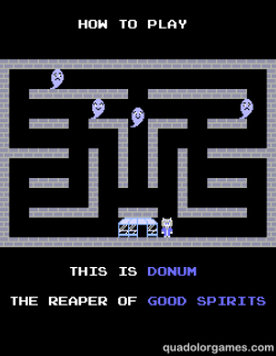
The first set of additions are two additional screens in the attract mode. The first one is a brief introduction to all the characters in the game, and idea I borrowed from Mappy:
Meet the folks.
The game itself did not have any detailed depictions of the two main characters Pohena and Donum, so I put (relatively) large portraits of the two on this screen. Both still adhere to the 4-colour palette limitations of all sprites in the game, if you break them down into individual 8×8 tiles. (It was actually much easier to do than I imagined.)
After the introductions, the attract mode switches to a gameplay demo. This where the game’s autoplay system plays back one of my attempts at beating the first round with both characters. As was the style at the time, the attempt was poor.
You suck at this game!
I’ll buy YOU for a dollar!
The second set of additions are the tutorial sequences that teach players how to play the game, replacing the instructions screen in the previous version.
… …
Yeah, I got nothing.
The tutorials demonstrate, by example, the basic rules of the game: what each player character’s job is and what they can or cannot shoot. There are four in all; they are shown before Rounds 1, 2, 3 and 8.
Copyright © Quadolor Games. All rights reserved.

Holiday Post thing

Whoa, it seems like forever since my last post. Since the Bit Bazaar ended, I’ve been focusing my attention on many things, some regarding Gonna Catcha and some not. But there’s no time to explain them all here, so I’ll pick the most important one.

As I mentioned in my last post, Gonna Catcha was played in an arcade-style environment at the Bit Bazaar on December 7. Players weren’t be able to read the manual to figure out how to play the game, as it wasn’t available to them. So in an attempt to minimize confusion, I added the instructions screen below, which was shown just before the first round started.

Crash course in spirit catching.


It explained the basic rules and goal of the game, i.e. what you can and can’t touch, what you should and shouldn’t shoot and how to progress.

I didn’t arrive at the Bit Bazaar when it started, so I might have missed some of the early birds playtesting the game. The first people I saw playing didn’t seem to have too much trouble figuring out what to do, but as the day went by and more people played, it became apparent that the instruction screen wasn’t doing its job very well. My guess that it was too brief and too detailed at the same time, and that confused people about the rules of the game. It presented all of the shooting and touching rules for each NPC type all at once, but due to the lack of space, the descriptions of each rules were too laconic. By the end of the day, I was back to my old ways, explaining the game myself and skipping the instructions screen, and things went by a lot smoother.

In retrospect, the instructions screen was more of a band-aid solution than a real fix to the problem. Since it was a bust, I figured that I need to go to Plan B, which is to use demonstration cutscenes to explicitly show how the game is played. As such, on my to-do-list I’ve promoted “Demonstration cutscenes” from “Optional” to “Necessary”. I also grouped it together with “Attract mode” because the two have one thing in common: the ability for the game to play itself. But before I get into that,


INSTRUCTIONS SCREEN, YOOOOOUUUUU’RE FIRED!!
Or kicked upstairs, whatever.

Ahem. So anyway, I’ve started working on the new instructions delivery method: new tutorial cutscenes that will replace the old instructions screen. Here is a screenshot of what it looks like so far:

Don’t fear him.
Essentially, it’s just a half-size level that plays itself to teach new players how to play the game. And speaking of playing itself, I’ve also started on making the autoplay system too. I think I’ve got the playback system working pretty well, the recording system on the other hand, which is only here to help me record gameplay to be played back by the autoplay system and may not be part of the final product, has a few bugs to work out. For starters, it generated a 500+ MB output file when it was only supposed to be a few kilobytes in size.

I feel bloated… ugh.

The recording code is working much better now. I’ll go into more detail about in a later post, because this one really needs to get out there. I don’t know when, because it’s the holiday season, with the whoop-de-do and hickory-dock. And don’t forget to hang up your sock, ’cause just exactly at 12 o’clock, he’ll be coming down the chimney, down.

P.S. Now that I think about it, Donum and Pohena bears some similarities to Sinterklaas and Krampus of Alpine folklore.  Krampus punishes naughty children while Sinterklaas rewards good children. Pohena and Donum does the same with spirits, according to the supplementary material.

Copyright © Quadolor Games. All rights reserved.

Gonna Catcha v.0.8 Post-Mortem (Oh no, somebody catch its spirit!)

Gonna Catcha is gonna be shown in the Arcade at the Bit Bazaar Winter Market on December 7 (the day after this post was originally published). Being an arcade-style game played in an arcade-style environment; Gonna Catcha will be put to the ultimate test in its own element. I’ve been working hard to get it polished up for public playing. Here’s a list of changes and improvements I made between v.0.7.4 and v.0.8.2:

High Score Tables and Name Entry

Your name registrated

This is no doubt the biggest change to the game since the latest update.  Instead of only keep track of one high score value, Gonna Catcha now keeps track of twenty high score values: the top ten for single-player and the top ten for co-op.  Not only that, it also keeps track of the highest round reached for that playthrough and, of course, the player’s initials, so that your valiant efforts will be remembered forever for future generations to admire, until someone bumps you off the list. Hmm, better stock up on quarters and snacks.

AAA – the undisputed champion

Instructions Screen

Crash course in spirit catching

As I mentioned earlier, Gonna Catcha will played in an arcade-style environment at the Bit Bazaar. As such, players won’t be able to read the manual to figure out how to play the game. Heck, they won’t even get the luxury of instructions printed on a cabinet. Sure, I’ll be there to help people out if needed, but frankly, after explaining the rules to the many new players to the game in previous playtesting sessions, I’m getting tired of it.
To minimize confusion and delay, I added the above instructions screen, which is shown just before the first round starts. This explains the basic rules and goal of the game: what you can touch, what you can shoot and what the heck is going on. The game’s “hidden” rules can be learned through experience. Hey, at least I’m not charging anyone multiple payments of 25¢ to learn the game by trial-and-error.

The Fourth Maze and Endless Play

How high far can you get?
After much procrastinating, I finally added a fourth and final maze to Gonna Catcha. This also means the game can finally be played endlessly, as it was intended to. Rounds 1 to 16 have a fixed distribution of spirits and pretas. Beyond Round 17, however, the distribution of spirits is randomized for each round, likewise with which pretas decided to show up in a round. In addition to that, spirit and preta movement gradually speeds up each time the maze changes after Round 17. Speaking of rounds, next we have…

Rearranged Rounds

I’ve probably played Gonna Catcha more than anyone else in the world, and because of that, I’m probably the most likely person to get bored of it. One problem I’ve noticed in my playtests is the round progression. Originally, you needed to play four straight “regular” rounds of spirit catching before you hit the bonus round, and then afterwards the maze changes and the cycle repeats. In all my playtest sessions, I was playing co-op with another player, and I felt fatigued at the fact that I had to endure four rounds of pretty much the same gameplay before two major gameplay changes happen one after the other. It’s not as bad in single-player because the character you control, and therefore the gameplay, alternates between rounds. Still, I knew something had to be changed for the sake of co-op mode.

The solution was simple: in each existing set of five rounds:

4 regular rounds → bonus round → (maze change) → rinse and repeat

I just moved the bonus round into the middle, i.e.

2 regular rounds → bonus round → 2 more regular rounds → (maze change) → rinse and repeat

This way, instead of having two major changes to gameplay every four regular rounds, now there is one major change for every two regular rounds. Hopefully by spreading out the changes, it will make the game more interesting to play for longer.

Pause Function

ザ・ワールド!時よ止まれ!*
One minor annoyance I had with Gonna Catcha while playtesting it was that I couldn’t pause the game when the other player had to attend to something else for a moment. After all, why would I need to put a pause function in an arcade game? There’s no time for pausing in the arcade business, time is money. However, since I’m not really interested in extorting quarters and attention from people in exchange for making it on the high score list, and the fact that I’ve already violated a few limitations and conventions of early-1980s arcade games, I decided to put a pause function in the game for the sake of convenience. Actually it was more like taking he pause code from Rise & Fall (shader and all) and plopping it into Gonna Catcha, hence the black-and-white blurry effect.

*ZA WARUDO! Toki yo tomare!

(Yes, it’s actually “Toki yo…” not “Toki wo…”.)
Copyright © Quadolor Games. All rights reserved.

Greetings from Gamercamp!

It seems like a long time since I last wrote a post. Since I’ve released the beta demo of Gonna Catcha, I have been less compelled to write about it since it’s much easier to learn about the game by playing it than sitting here reading about it. Also, I was going to post about the International Archaeology Day playtest session with Rise & Fall, but the post ended up being not very interesting on it own, so I’m going to combine it with the Gamercamp playtest session post I’ll write about after Gamercamp, which is happening right now. Yay.

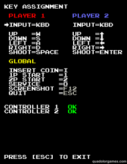
In the meantime, I suppose I can talk a bit about what was added to Gonna Catcha since it’s release. Aside from several major bug fixes that somehow slipped through my keen eye, the biggest update to the game is the inclusion of several new options in the game’s Service Mode (fancy arcade talk for “Options Menu”).

Well, there’s your problem.

I feel like I’m being very thorough with the amount of customization you can do with the game, and I haven’t even put in the sound test or let the player customize gameplay settings yet.

During the development of the co-op mode, I had difficulty deciding how to bind the controls to what keys on the keyboard without the two player bumping their hands into each other. Also, what might be the ideal key bindings for co-op might not be for single-player mode and everyone has their own preferences on what the best key bindings are. In the end, I decided to let the player(s) figure out what controls work best for them and put in a key configuration menu.

UNLIMITED POWER!

This is the first time I’ve made a key binding system for a game and it turned out to be less trouble and error-prone than I imagined. GameMaker: Studio has built-in functions for rebinding keys, but I ended up creating my own solution.

With great power comes great responsibility.

I have received some feedback from people who played the demo. Aside from pointing out the bugs, most have praised the retro arcade art style and audio of the game, saying that it’s quite accurate and devoted. One thing that came up was some people had trouble getting the game started because they couldn’t find the “Insert Coin” key. So to help new players, I added “key reminders” on the title screen to help them get started.

I don’t understand your crazy
moon controls!
I also made the list of default key bindings clearer in the manual (if people actually read that thing). for those acquainted with the controls, there is an option in Service Mode that allows you to turn the reminders off for a more authentic arcade experience.

Oh man. *tap* *tap* Which button is it?
*tap* *tap* *tap* *tap*
What would make it even more authentic is an entire arcade cabinet, but let’s not get ahead of ourselves.
Copyright © Quadolor Games. All rights reserved.

So much to talk about, so little time to write about it.

I seem to be falling behind on my plans to update this blog once a week.  Every time I implement an idea and am in the middle of writing about it, another idea comes to mind.  I end up holding off writing my post to execute the new idea so that I can put that into the post too.  I need to a way to synchronize my blog cycle and ideas cycle together…
Yeah, I  don’t think that would work very well with only one person.

For the same reasons, this update is just another text + screenshots update instead of the video update I had planned earlier, which would have shown the game as it is now in action and demonstrated the audio as well (mostly the newly added sound effects).  I guess that will have to wait for another time.

Anyways, there are four things I would like to talk about today:  New HUD, Title Screen, Vector Stuff and Shaders.

New HUD

First up, I’ve made some changes to the gameplay and HUD (the two are related).  Below is a screenshot of the current in-game display:

HUD 3.0

You will see that the HUD now takes up both the topmost and bottommost portions of the display, making the levels themselves slightly shorter.  First, let’s have a closer look at the top HUD:

New top HUD

And for comparison, let’s throw up the old HUD here as well:

Old HUD is old.
Aside from the different colours and the fact the second player isn’t active, there two main changes to the new HUD, which also reflect changes to the gameplay:
  1. A score counter is now where the life counter used to be in the top-left.  Previously I wanted the score to be tallied at the end of each level (in the style of games such as Battle City and Ice Climber).  However, I’m making some changes to the scoring system that would make that tally system impractical, such as rewarding more points per spirit returned to the shelter/jail in a single trip (think along the lines of Pac-Man‘s scoring system when you eat multiple ghosts in a row).  I may still have an end-of-level score tally for bonus levels.
  2. Remaing spirit counters are now where the round counter used to be in the top-center (not to be confused with the in-hand spirit counter just below the score).  In the original round flow, all the “target” spirits you needed to capture for a particular round appeared at the beginning of that round.  There was a maximum of 5 spirits you needed to capture per round; I felt that this number was too low and made each round too short.  Increasing the maximum number made the level too crowded when you also take the “nuisance” spirits (i.e. the ones that you don’t need to capture) and hungry/vagrant ghosts into account. Also, it was also balanced out by the spirits clumping together, making it easier to capture more in a single “trip”. My solution for this is to have a 4-5 on-screen spirit limit and then spawn more when the number on-screen falls below the limit (much like Pengo and Battle City, again).  The remaining spirit counters show how many spirits have yet to be spawned.  

Now let’s look at the bottom HUD:

New bottom HUD
This is the new home of both the lives and round counters.  Also, the lives counter uses character icons now rather than hearts.

Title Screen

Next up, I’ll briefly show and describe the title screen, which is still under development:

What? It didn’t say “Coin chute required” in the system requirements!
I want my quarters back!
There are still a few things I need to add to it:

  1. A graphical title to put up top rather than just having “G O N N A   C A T C H A”
  2. in plain text.

  3. a score table (so player will know what is worth what in the game).

Vector Stuff

Next, have a few vectorized spirits:
Two down, four more to go.

Shaders

Finally, if you haven’t figured it out already,

Shaders are coming coming to GameMaker: Studio 1.2, which is just around the corner.  I can wait to see what kind of 2D graphical hijinks I’ll get into when it does, such as better CRT monitor simulation. (Maybe?)

Well, so long. See ya next time.
Copyright © Quadolor Games. All rights reserved.

Let’s look at level design (sorta) and the 鬼. Er, I mean GUI.

This post will be a bit brief, as the things I’ve done with Gonna Catcha are rather simple and better expressed in a series of images.
The first thing was to the grid resolution for the game’s levels.  The old 16 x 16 cell size made the test levels feel small and their designs limiting:
Not that I actually tried designing them.  I mean, putting
Internet speak into a level’s design is SOOOOO gauche.

So I reduced the cell size to 8 x 8, allowing me to cram more details, hallways, twists and turns into a single level:

This might be a little overboard.
Feeling… lonely?
The second thing are some proposed changes to the user interface at the top of the screen:
Possible new user interface.

The addition of a round timer below the round counter.  To my knowledge, all arcade games have a way for it to reliably to bring itself to a game over state, in case the player(s) abandon the machine mid-game.  That way, it wouldn’t waste precious quarter-sucking time.  For many arcade games this comes naturally, by having enemies that persistently chase and/or attack the player(s) until all lives are lost. For games that don’t have that guarantee (Gonna Catcha included), a round timer is used to make sure the game ends.

Also, if the either the number of lives remaining or number of spirits in-hand exceed five, then that counter will switch to a digital counter:

Too…much…stuff…

Copyright © Quadolor Games. All rights reserved.